|
A system that provides the main statistical data provided by the national government and private companies in graphs.
|
List of countries
List of Prefectures
List of Prefectures
List of cities
- A-E
- F-J
- K-O
- P-T
- U-Z
Help
Things you can do on this website
① You can visually check representative statistics indicators (indicators) from the "Chart" menu!
More・Multiple time point chart for 1 region = Time series
・Multiple region chart for 1 time point = By region
You can easily switch over with a simple operation!
regional rank (Each country, Japan, Prefecture, City),
an animation function, sorting function and a function that displays a color coded map!
→ Go to Explanation of screen functions for details
② You can also download statistics indicators (indicators) other than ① above from the “Data” menu!
More→ Go to API for details
Example of how to use this website (video Japanese available)
Explanation of screen functions
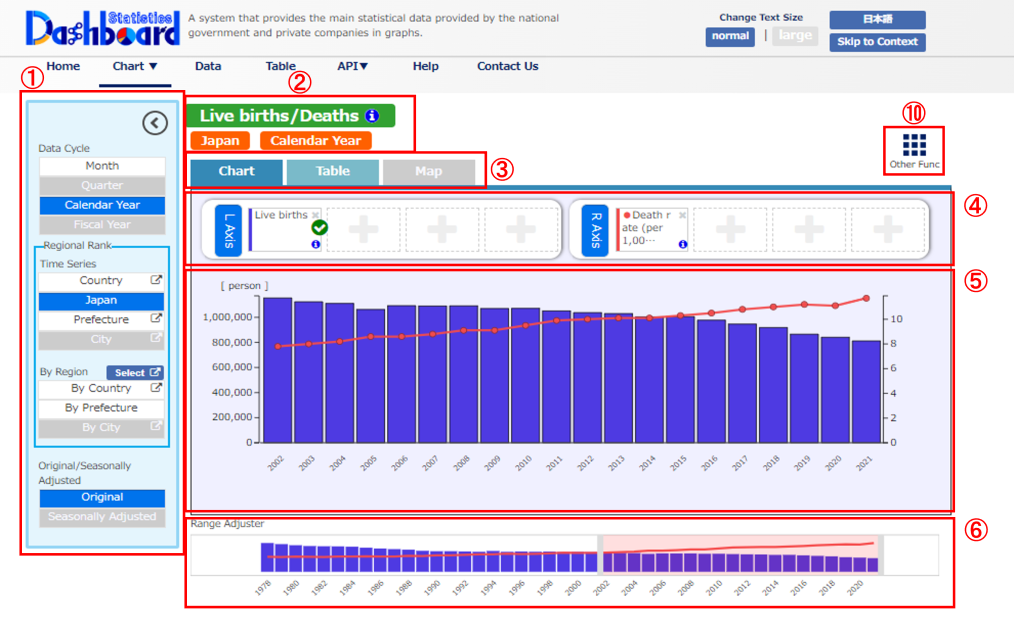
① “Data Change”menu
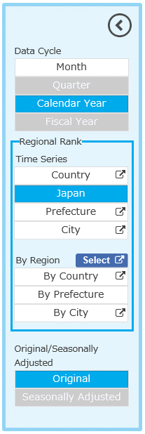

Click to close the window on the left. (Click again to open the window.)
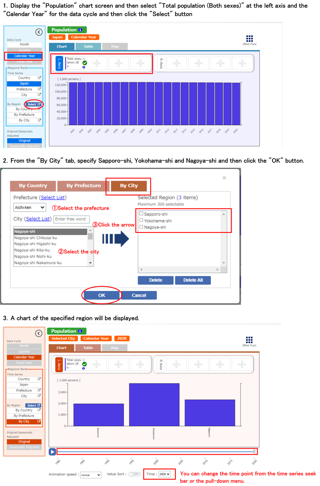
You can change the “Data cycle”, “Regional rank (Time series)”, “Regional rank (By region)” and “Original/Seasonally adjusted”.
The background color of each cell can be blue, representing the current region, white, showing it can be switched, and gray, showing it cannot be switched.
| Data cycle |
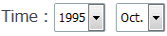
You can select “Month”, “Quarter”, “Calendar year” and “Fiscal year” for the data cycle. The cycle studied will differ depending on the indicator. (Only cycles in which data exist can be selected.) |
|
|---|---|---|
| Regional rank | Time series |
Transitions to the screen for a chart with multiple time points for the 1 specified region (time series chart). For anything other than “Nationwide (Japan)”, a separate window will display to select the region. The region studied will differ depending on the indicator. (Only regions in which data exist can be selected.) |
| By region |
Transitions to the screen for a chart with multiple regions for the latest time point (by region chart). The region studied will differ depending on the indicator. (Only regions in which data exist can be selected.) You can specify a region you want to display in the chart by country, prefecture and city by clicking the Select button. |
|
| Original/Seasonally adjusted |
You can change original/seasonally adjusted figures. Original figures are the original numerical values that have not been adjusted for seasonal variation. Seasonally adjusted figures are numerical values from which variation due to seasons (things that have annually similar trends caused by the season) has been removed from the original figures. Seasonally adjusted figures are not studied for some items depending on the indicator. (This can only be changed when data exist.) |
|
You can select only 1 choice from 7 choices, not 1 selection from each, for regional rank (time series) and regional rank (by region).
Regional rank (time series) displays in the time series chart while regional rank (by region) displays in the by region chart.
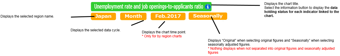
② Chart title labels
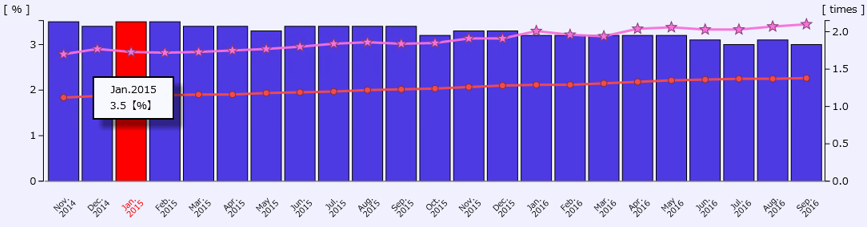
Region name, data cycle and original/seasonally adjusted as selected in the chart title and also the ① ”Data Change” menu are displayed. Also, the chart time point is displayed for by region charts.
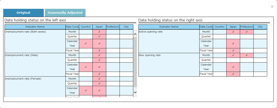
Data holding status for each indicator linked to the chart
Displays whether data is held for each indicator, data cycle and regional rank.
You can switch to each data holding status by clicking the “Original” and “Seasonally Adjusted” tabs.
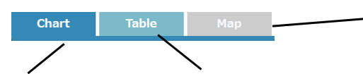
③ Display area switching tabs
* Can only be switched when the region chart "By prefecture" is selected.
Only 1 indicator can be displayed on the color coded map.
The displayed indicator is the indicator selected at the
④ Indicator selection menu (has a green check mark).
(“Chart” is selected by default.)
④ Indicator selection menu
※ Up to 4 indicators can be selected for each axis.

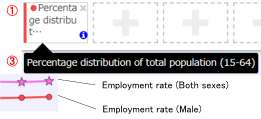
Explanation of indicator labels
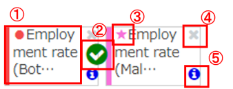
(An abbreviation of the name is displayed and not the official name due to space constraints.)
Hover over it to display the official name in an info balloon.
② [Check icon] Displays indicators selected.
(Refer to Selecting indicators for details)
③ [Chart element marker] Displays an icon and color of the chart marker in the chart display area.
(The left side color corresponds to the chart color for bar charts. There is no icon.)
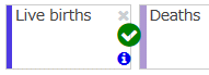
④ [Delete button] Deletes the indicator. (Refer to Deleting indicators for details)
⑤ [Info button] Displays detailed information for the indicator.
(Refer to Detailed information on indicators for details)
Selecting indicators
(This will assign a green check icon).
Only 1 indicator can be selected per screen. The indicator on the far left will be selected by default for both the left and right axis.
* Selected indicators are used for color coded maps, the sort function and the automatic hide function for the axis.
(Refer to ③ Display area switching tabs, ⑥ Range adjuster slider and Automatic hide function for the axis for details)
Adding indicators
 When you want to add an indicator, click inside the “+” dotted area. This is the same when clicking any of the areas at both the left and right axis.
(If there is no “+” dotted area, a total of 8 indicators can be selected for the left and right axis and any more than this cannot be added.
Therefore, please delete any of the indicators.)
Click to display a list of indicators that can be selected for each axis.
List of indicators that can be selected for each axis
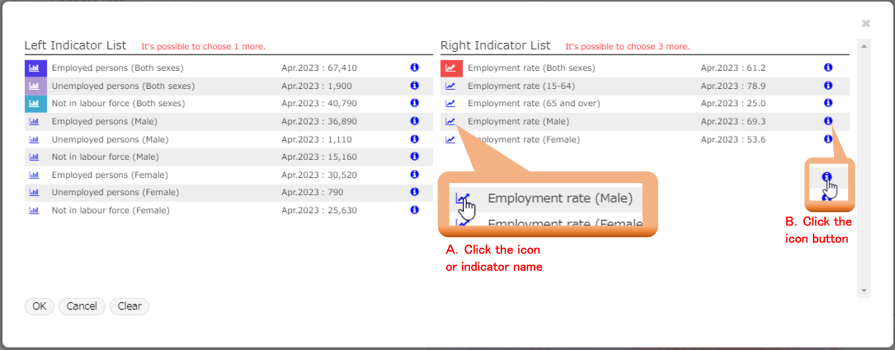
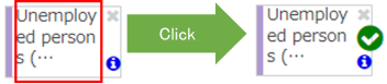
A. Click the chart icon or indicator name at the left side of each line in the list to change the icon color and select the indicator in that line.
(Click again to clear the icon color and remove the selection for the indicator in the line. Refer to Deleting indicators for details.)
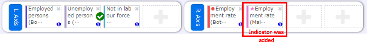
Then click the “OK” button to confirm the indicator selection. The selected indicator bar chart and line chart will be added to the screen.
B. Click on the info button on the right side of each line in the list to display detailed information for the indicator in that line. (Refer to Detailed information on indicators for details)
Detailed information on indicators
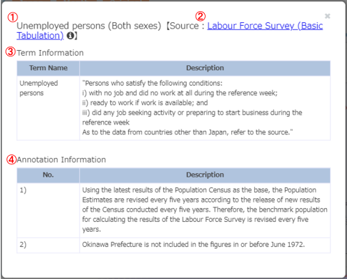
① [Indicator name] Displays the name of the indicator.
② [Source] Displays the statistical survey from which the indicator data was acquired.
Click the hyperlink to move to a website showing the statistical survey.
Hover over the info icon to display an overview of the survey.
③ [Term Information] Displays an explanation of technical terms included in the indicator name.
④ [Annotation Information] Displays annotation concerning the entire indicator.
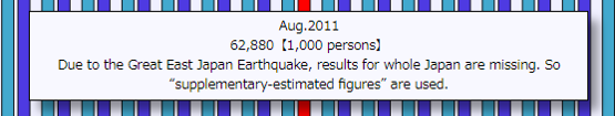
(Annotation information for single data is displayed by hovering over an element of a bar chart for the data.)
Deleting indicators
You can also use the list of indicators that can be selected for each axis which was explained when Adding indicators.
Click the colored icon or indicator name of the indicator you want to delete and then click the “OK” button.

Switching button to instantly display/hide the entire axis
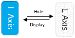
Each click will switch between display ⇔ hide.
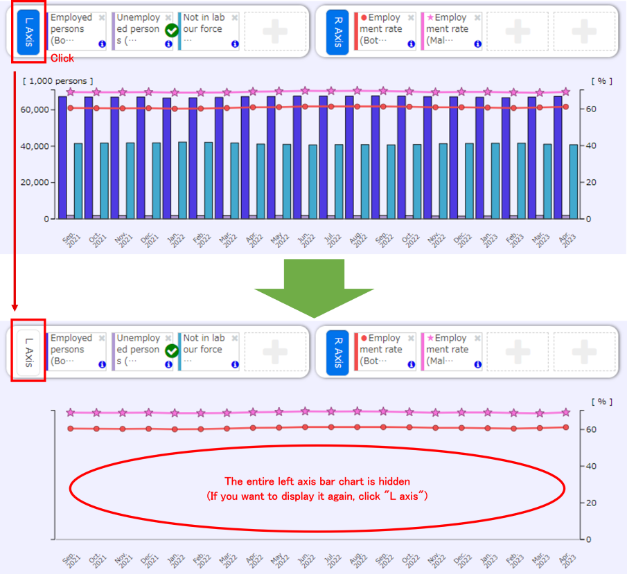
Automatic hide function for the axis
Indicators on the “right axis” are basically related to percentages and rate of change and are represented by a line on time series charts.However, with by region charts, since a region axis sorting function is available, and it is not suitable to represent the points of a horizontal axis as a line because it is not constant,
the “right axis” is also represented using a bar chart.
Therefore, on a by region chart screen, up to a total of 8 indicators are represented entirely on a bar chart but when considering the screen width, the bar chart will be too detailed and difficult to see.
When switching to a by region chart, axis without a green check icon are automatically hidden. (If you want to display the hidden axis, click the “L axis” or “R axis” button for the axis that was hidden.)
⑤ Display area
The area that displays the chart and table. Selecting the ③ Display area switching tabs will change the displayed content.
Chart
Displays when the [Chart] tab is selected.
Hover over a chart element to display the element value and annotation (if it exists) and also the time point (region name for by region charts).
Click a chart element to select the time point (region for by region charts) for the element.
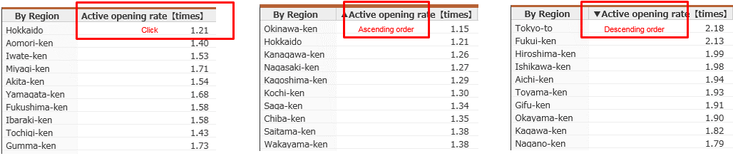
Table
Displays when the [Table] tab is selected. Displays the background data in a table format used to display the chart.
 For time series charts, “Time” display in the leftmost column.
For by region charts, “Region name” display in the leftmost column.
Also, clicking on the column header will sort the ascending/descending order.
(Each click will switch the order between ascending ⇔ descending.)
If there is annotation for single data, hover the cursor over the data to
display the annotation.
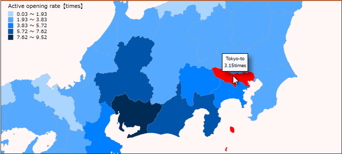
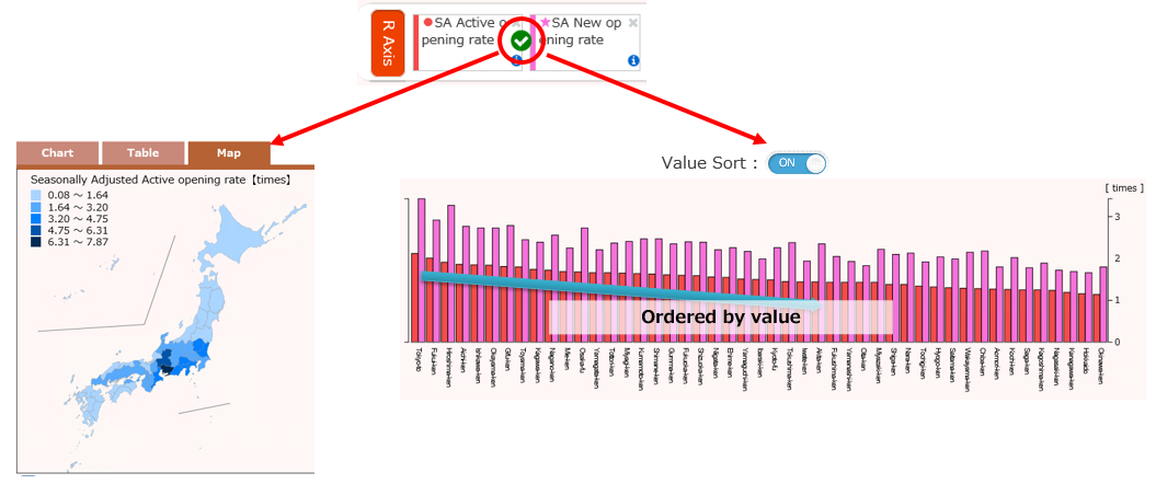
Map
Displays when the [Map] tab is selected. Displays a color coded map by prefecture.
※ Can only be switched when the region chart "By prefecture" is selected.
Only 1 indicator can be displayed on the color coded map.
The displayed indicator is the indicator selected at the ④ Indicator selection menu (has a green check mark).
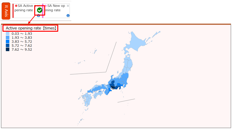
You can zoom into and out of the map using the mouse wheel.
You can also move the entire map by dragging on the display area.
Hover over any prefecture on the map to display the region name and its value.
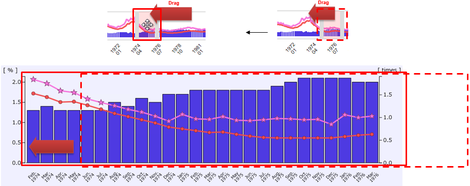
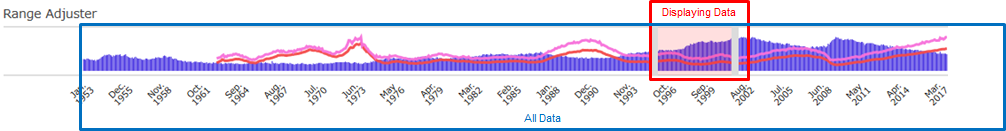
⑥ Range adjuster slider, Time series seek bar
When the time series chart is displayed, the Range adjuster slider displays.
When the by region chart is displayed, the Time series seek bar displays.
Range adjuster slider
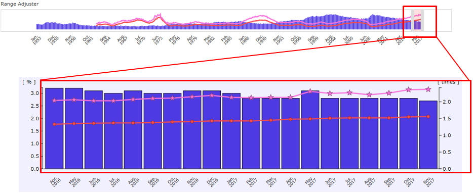
You can change the time range for the chart displayed at the top of the screen.
The pink colored area is the currently displayed range and dragging the left and right bars allows you to change the time range.
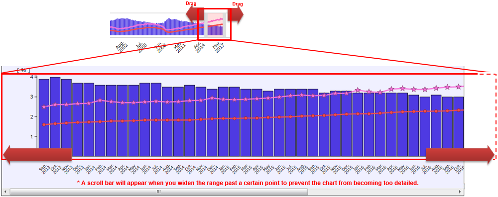
You can move the time point without changing the range by dragging inside the left and right bars.
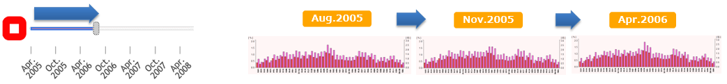
Time series seek bar
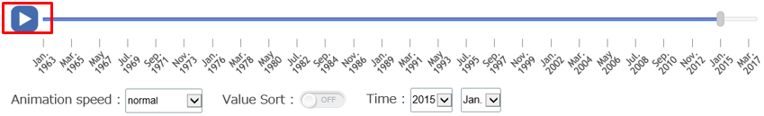
Press the play button to return the seek bar to the leftmost side and play an animation in which the by region chart time point in the ⑤ Display area switches automatically.
(Default setting is “normal”)

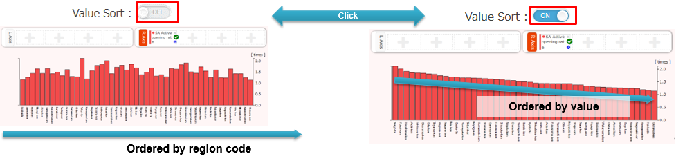
Value sort function
Clicking the value sort switch (OFF→ON) will sort the horizontal axis region in the order of the largest indicator value selected in the ④ Indicator selection menu (has a green check mark).
Clicking the value sort switch once again (ON→OFF) will sort in the order of the region.
(When the value sort switch is “OFF” by default, the horizontal axis is arranged in the order of the region code.)
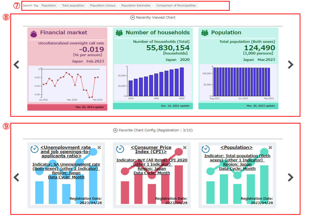
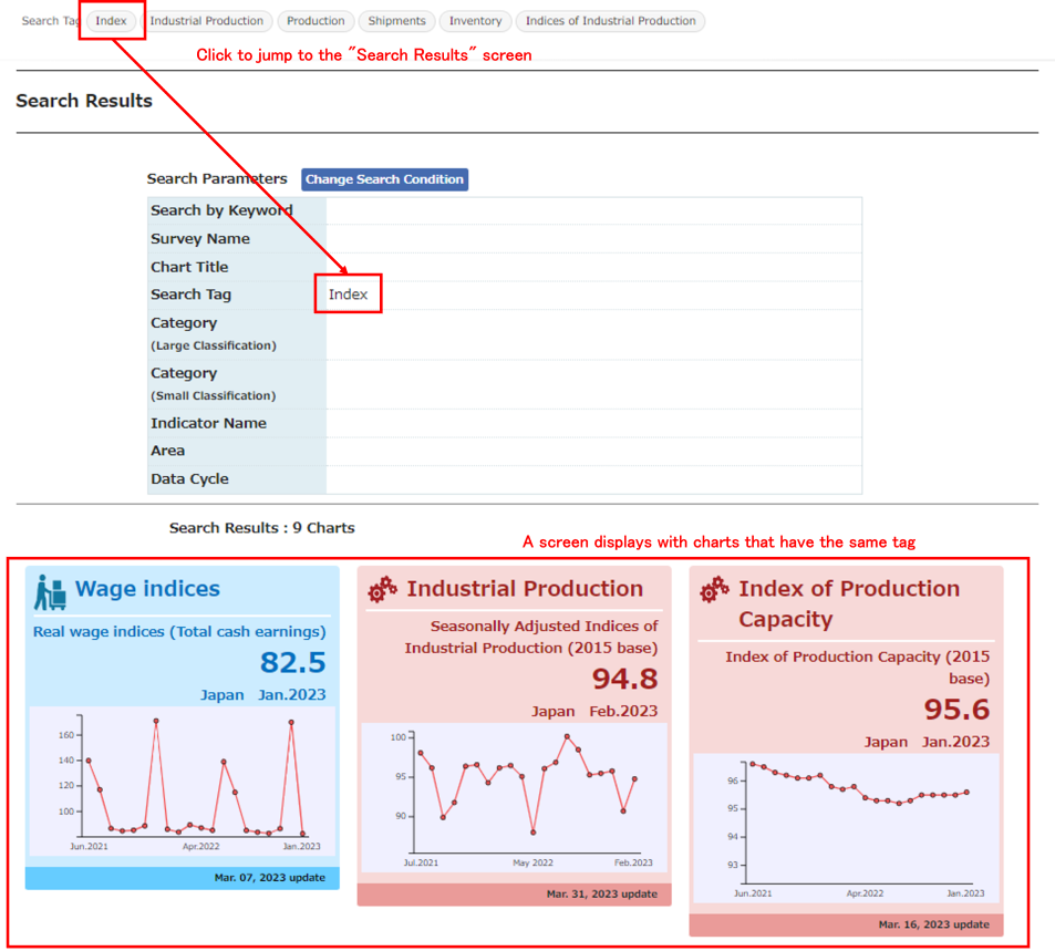
⑦ Search tag
Each chart screen has a related “tag” linked to it. Clicking on a tag will display a screen of charts that link to this same tag.
Please use the tags when you want to view similar or related charts.
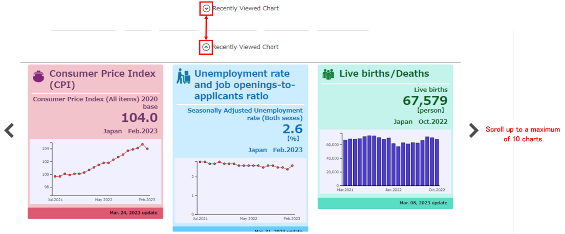
⑧ Recently viewed chart
Displays charts you recently viewed in a list of thumbnail charts. (The list is hidden by default).
Up to the most recent 10 charts are displayed. Clicking on a thumbnail chart will jump to a screen showing the chart. Please use this when you want to return to a previously viewed chart.
※ Settings performed for the chart are not saved (such as selected indicators and data cycle). If you want to save the settings, please use the ⑨ Favorite chart settings function.
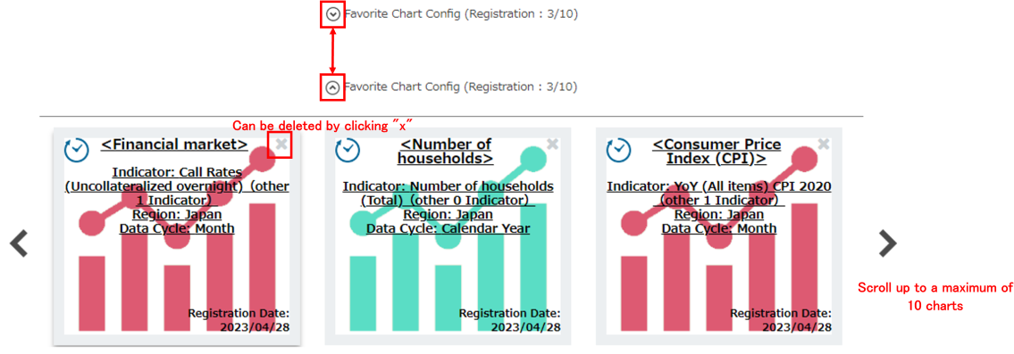
⑨ Favorite chart settings
 Displays chart settings registered using the “Favorite“ button listed in ⑩ Other functions. (The list is hidden by default).
Up to 10 charts are displayed. Clicking on a thumbnail chart will jump to a screen showing the chart.
Indicator selection, chart type (time series or by region), region name (regional rank), time point (only for by region charts), and data cycle are saved and can be restored with a single click.
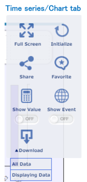
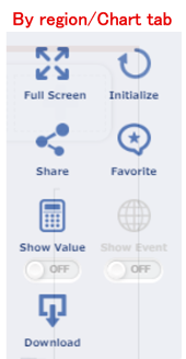
⑩ Other functions
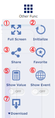
① [Full Screen] Displays the chart screen in full screen mode. Click “Esc” on your keyboard to leave full screen mode.
② [Initialize] Returns the chart screen to its default setting.
The chart type returns to a time series chart and indicator selection, regional rank and data cycle are returned to the state they were when the screen was first opened.
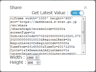
③ [Share] Use when you want to embed the currently displayed chart on another website.
(This is an advanced function for developers.)
Click the share button to display the dialog box shown on the right.
HTML iframe information displays so please copy it.
You can change settings for whether to acquire the chart width, height and latest values in the dialog box shown on the right.
④ [Favorite] Saves the indicator selection, chart type,
region name (regional rank), time point (only for by region charts), and data cycle displayed in the current chart and registers them in the ⑨ Favorite chart settings.
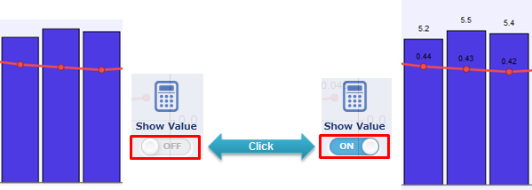
⑤ [Show Value] Switches between displaying (ON) or hiding (OFF) values in the currently displayed chart.
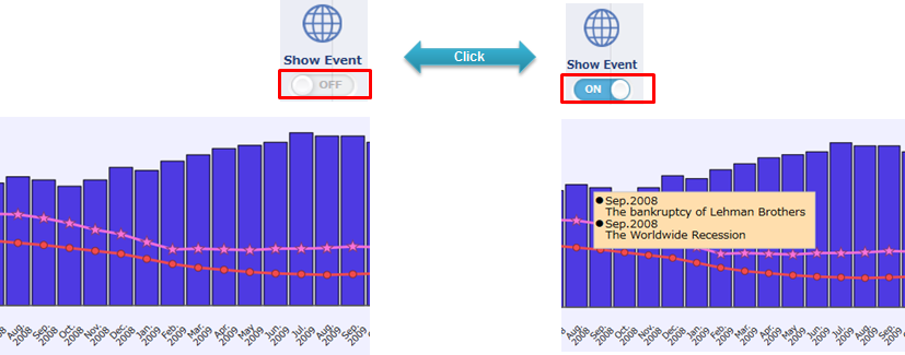
⑥ [Show Event] Switches between displaying labels (ON) or hiding labels (OFF) for social events in the currently displayed chart.
⑦ [Download] Download data.
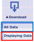
[Displaying Data] Download a csv format (UTF8) file containing data in the range of the chart displayed on screen.
Enabling and disabling “Other functions”
The various buttons in the “Other functions” area are enabled and disabled depending on whether [Time series] or [By region] is selected and which tab is selected from among [Chart], [Table] and [Map].
(All functions can be used)
• Download is fixed at [All Data] because there is no range specification
• The [Show Event] function cannot be used because it is a single time point
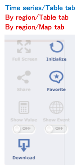
• Cannot use the full screen, share, show value and show event functions at the table or map tab
Recommended environment
The following browsers are recommended to use this website.[PC]
| Browser | Version |
|---|---|
| Edge | Latest version |
| FireFox | Latest version |
| Chrome | Latest version |
| Safari(OS X) | Latest version |
[Smartphone & Tablets]
| Browser | Version |
|---|---|
| Safari(iOS) | Latest version |
| Chrome | Latest version |
The rest of the website displays the same as the PC website.
FAQ
- Q1. Is there a list of the data provided for “Data” and the charts that can be viewed using “Chart” on this website?
-
You can view a list here (Provided_data_list).
-
Q2.
Why can't I select the country and city in the "Data Change" menu?
I can’t switch the regional rank. -
Whether it can be switched depends on the data cycle, original/seasonally adjusted selection selected at "Data Change" menu and the indicator currently selected at the Indicator selection menu.
When selecting multiple indicators, if all the indicators do not have a “✔” in the “Data holding status for each indicator linked to the chart” table opened using the info button in the chart title label, switching will not be possible. When switching is not possible, review the indicator data holding status and data cycle.
※ The reason is also the same as above for “I can’t switch the data cycle.” “I can’t switch original/seasonally adjusted figures.”
[Ex.] When displaying a chart by city for “Construction starts of dwellings”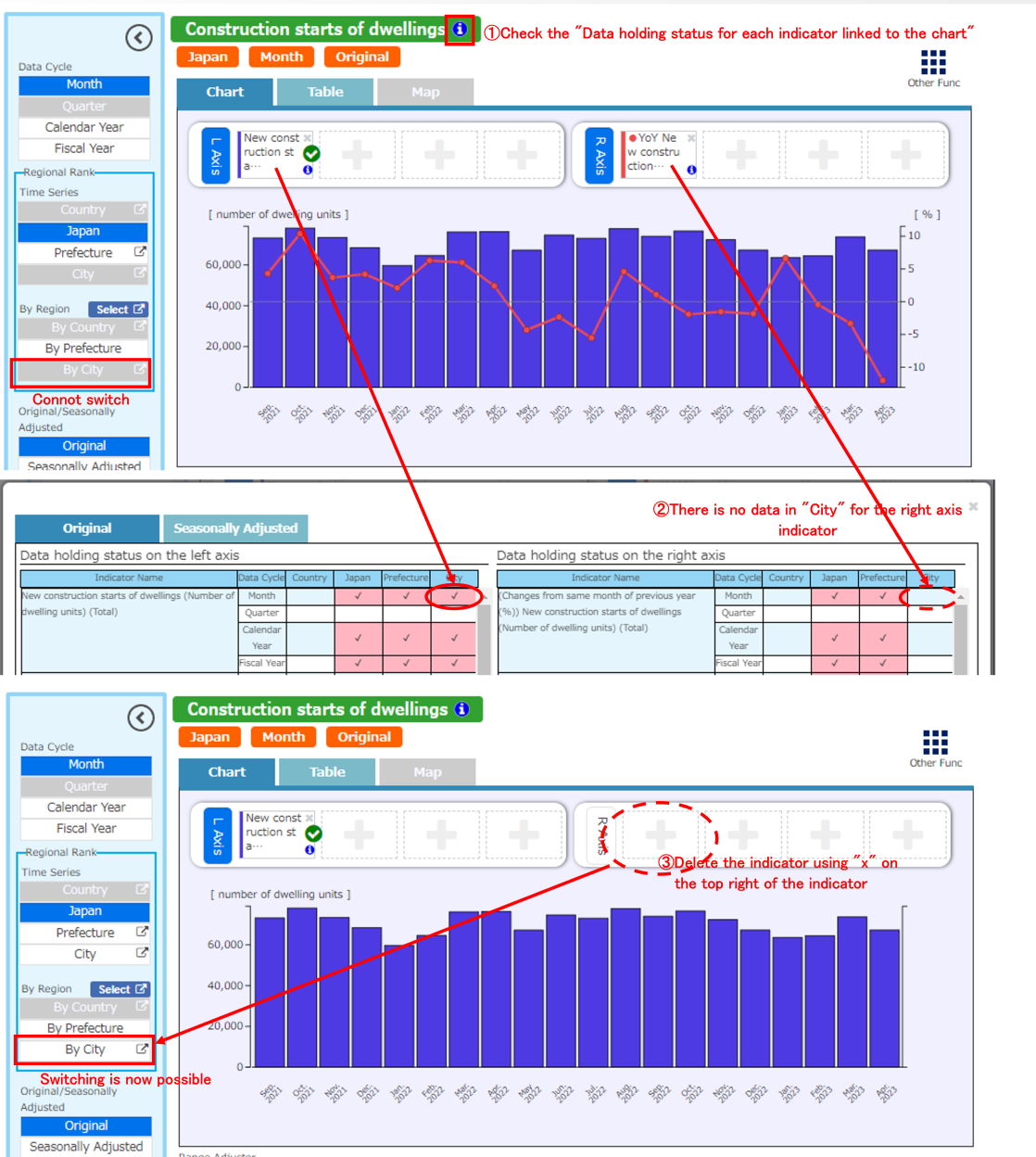
- Q3. Can I print the chart screen?
-
Unfortunately, a direct printing function is not supported. However, you can use the printing function in your browser to print the screen.
When doing so, you can zoom in and print using the “Full Screen” function.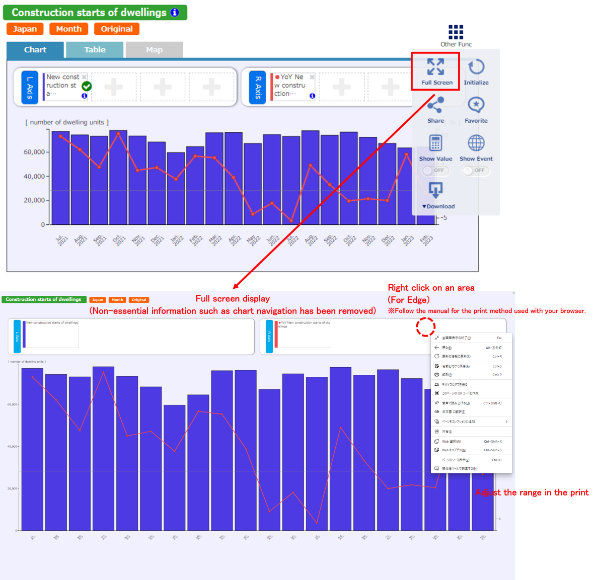
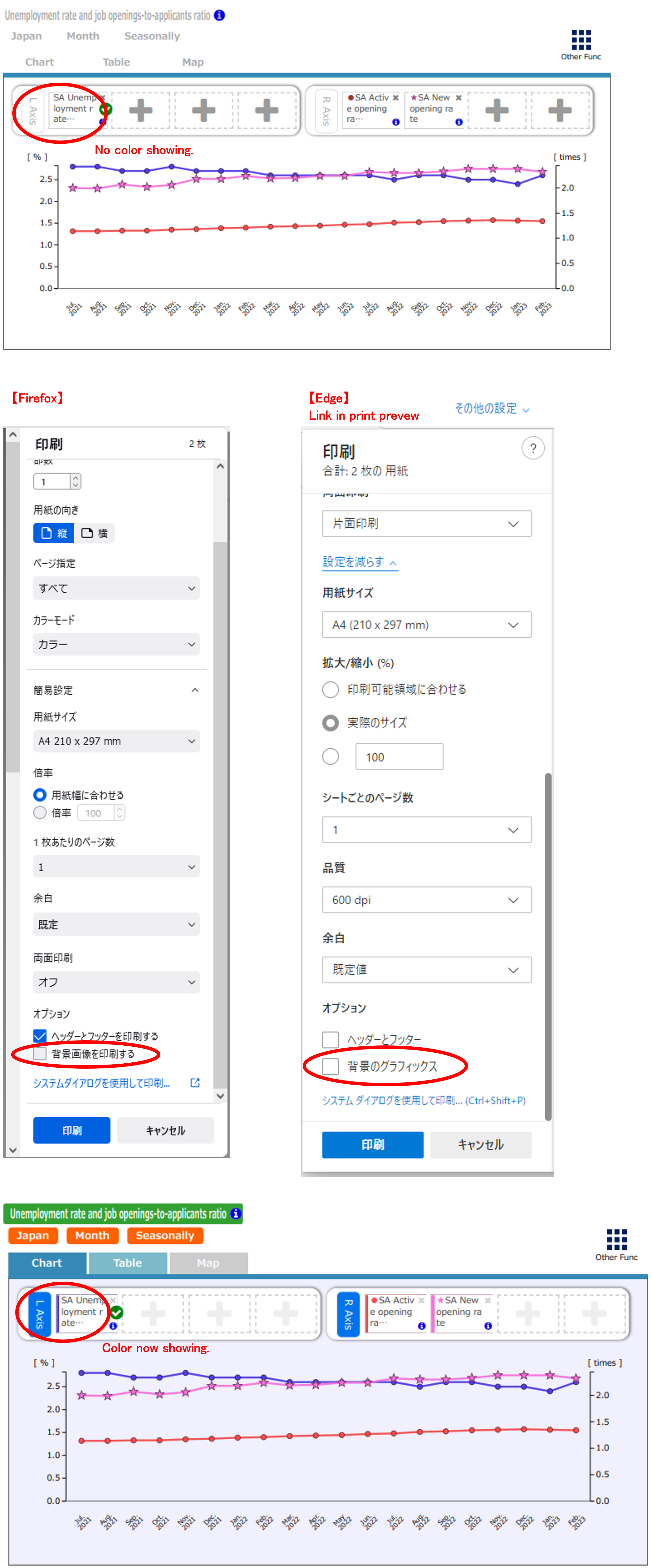
- Q4. Why is the background color not output when printing?
-
In the printer settings of your browser, select the “Print Background Colors and Images“ check box to have the background color appear in the printout.
- Q5. When is the green check mark attached to indicator labels used?
-
Selected indicators (those with a green check mark) are used for color coded maps, the sort function and the automatic hide function for the axis. (Nothing changes if they are just clicked and selected.)
Please refer to Display area switching tabs, Range adjuster slider, and Automatic hide function for the axis for details.
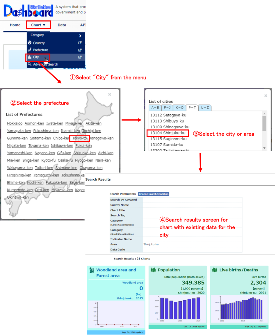
- Q6. How do I view only charts for a specific city? (Updated December 20, 2017)
-
To search data for a specific city, you can search charts with existing data for the city by clicking on “Chart” → “City” at the top of the screen.
※ The process is the same as when also searching for a specific country or prefecture.
- Q7. What is the difference with “Nationwide (Japan)” when “Japan” is shown in the choice for by country and each country?
-
In principle, the figures will be the same as long as the indicator names are the same. However, each data source and publication time is different so they may not always match.
Furthermore, the figures will be different if the unit is different (such as JPY and USD).
Please use “Nationwide (Japan)” or "Japan" depending on your purpose for viewing the charts, such as if you are comparing in time series, use “Nationwide (Japan)”, and if you are comparing regions, use “Japan” in the choice for each country. - Q8. How do I display time series data for multiple regions (multiple time points) at the same time?
-
You can display a chart with multiple time points for a single region and a chart with a single time point for multiple regions but unfortunately it is not possible to display a chart with multiple time points for multiple regions.
However, for data with multiple time points for multiple regions, you can use the data search function from the “Data” tab and then download it. - Q9. Why did a chart I previously registered in “Favorite” disappear?
-
The “Favorite” charts are saved in a temporary area referred to as Web Storage by your web browser.
Therefore, if you have deleted your Web Storage information, the “Favorite” chart information will be deleted.
In such a case, you will need to register your favorite chart again. - Q10. Can I compare specific regions on the chart screen? (Added December 20, 2017)
-
You can specify regions you want to display in the chart (by country, by prefecture, by city) and then compare them on the chart screen by using the "Select" function in a by region chart.